Are you chart smart? 3 Stupid charting mistakes.

I’m sure you use a chart or two in your presentations, PowerPoint decks or ops reviews. Maybe you use four or five. Perhaps you have four or five charts on one slide. If you do, shame on you.
But are you making these three common charting mistakes?
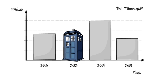
The TimeLord Chart.
On the surface, the Timelord can pass as a normal chart, in the same way a Galifreyan can pass as human. It’s the subtle differences that make this chart a problem. First there’s the utter indifference to the laws of nature and the linear flow of time. For most humans, time flows forward. The year 2010 is followed by 2011, then 2012 and so on. The Timelord turns this conceit on its head. Time flows backwards, from right to left, instead of forwards, from left to right. Then there’s the prediction of the future boldly stated as if it has happened. No dotted lines or subtle shading to indicate a projection or an estimate for the Timelord.
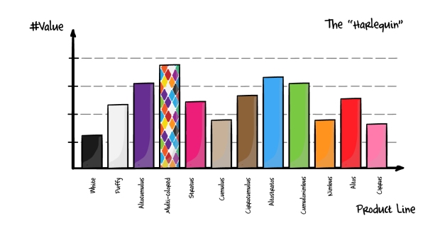
The Harlequin Chart.
Principally the reserve of the color-challenged and the default settings in excel, the Harlequin pops up when showing multiple values and selecting automatic fill in excel. The problem here is all the colors do is show that you have a different category or column. We’re not showing any meaning or pattern, we’re showing a meaningless pattern. Color is a great way of showing something with your data, such as highlighting a particularly successful product line, or grouping together like things. If it’s just used for random decoration, or worse, because you haven’t figured out how to change a default setting in Excel before you import to PowerPoint, it’s just an eyesore.
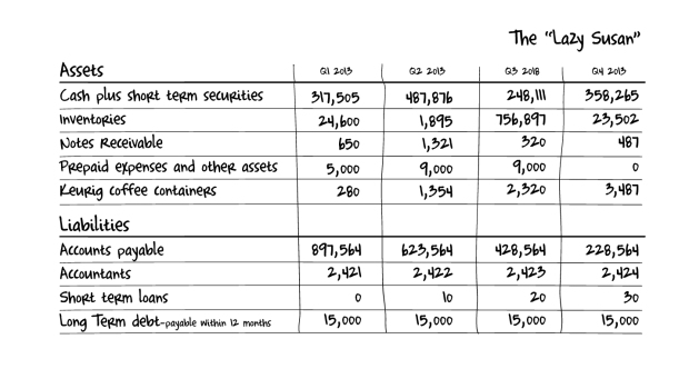
The Lazy Susan Chart.
The Lazy Susan, AKA the POT, AKA the plain old table, AKA I have a lot of data here and I didn’t know what to do with it, is perhaps the entry-level offender of our line-up of chart criminals. It’s very easy to do when under a time crunch, when you want a little cya in your briefing or you simply want to show how much work you’ve put in to collecting your data. The trouble is that although you may have a lot of data, you didn’t do anything with it. You may want to cya, but it’s just as likely a number you dumped on your slide and didn’t really want to talk about in your ops review is the one that comes up. Tables won’t show patterns, and hide mistakes. They should be used solely for reference and back up, and sparingly in presentations. If you have more than 2-3 rows or columns, rethink how you want to present that data. Don’t be a lazy Susan.*
Have you made these mistakes?
You may have made some of these mistakes. Congratulations young Padawan, recognizing your errors is the first step to improvement. There are some great experts out there that can help. If you want to improve how you handle data, polish your plotting or brush up your bar charts, I recommend you start here.
Storytelling with Data. Cole Nussbaumer.
Excel Charts. Jorge Camoes.
The Functional Art. Alberto Cairo.
NBR Graphs. Naomi Robbins.
*My apologies to all the Susans that were offended in the making of this pun.
…
 Gavin is a founding partner at fassforward consulting group.
He blogs about PowerPoint, Presenting, Communication and Message Discipline at makeapowerfulpoint.com.
You can follow him on twitter @powerfulpoint.
.
More at Google+, Facebook and Pinterest. Comments are welcome, links are
appreciated. If you’re interested in writing guest posts for this blog, please contact me.
Share
- Click to email a link to a friend (Opens in new window)
- Click to print (Opens in new window)
- Click to share on LinkedIn (Opens in new window)
- Click to share on Twitter (Opens in new window)
- Click to share on Facebook (Opens in new window)
- Click to share on Tumblr (Opens in new window)
- Click to share on Reddit (Opens in new window)
- Click to share on Pinterest (Opens in new window)
- Click to share on Pocket (Opens in new window)


I have never seen a presentation “utilizing” the TimeLord? Have you really and on what type of presentation?
Boris,
I’m surprised. I’ve seen plenty. Actually, that’s where the original inspiration for this post came from. I was observing a sales ops review in a Fortune 500 company, and there was a timelord chart tucked in one corner. In this company, they have a habit of squeezing four charts on a page, I think to save space. Naturally this doesn’t help understanding.
I think sometimes it’s from people wanting to show this years numbers, which they put in the first column or bar, and then follow up with other years, which means (to me) it’s a deliberate, if misguided choice. I’ve seen some which are so obviously the default settings in excel cut and paste into ppt that I am sure that’s how the chart first appeared after clicking the button. The last variant of the timelord, the projection with no dotted line is probably the most frequent.
Gavin
Gavin, I think you need to train them on which graphics needs to be used when and how. What you are saying is really sad! I have seen a lot of bad presentation, but “The Timelord” – that’s too much! 🙂
Well we try. The first step to learning is becoming aware. LMK if you see any other kind of dumb charting mistakes. Thanks.
Gavin:
Another problem with the Harlequin Chart is use of vertical labels to go with the vertical bars. Those are reasonable in a magazine article, where the reader can rotate the page 90 degrees to the left to read it. In a presentation you should not ask your audience members to tilt their heads almost ninety degrees left just to read your labels. Use horizontal bars instead.
Great point!
Gavin:
That 90-degree head tilt is known as the Goren Lean, from its use in the TV show Law and Order – Criminal Intent: http://detectiverobertgoren.blogspot.com/2008/11/goren-lean.html
Richard